I’m Mike
O’Neill and I’m a data nerd who uses Azure Data Explorer, or Kusto, every day
to glean insights into Azure’s developer and code-to-customers operations.
In my last
video, I talked about how to assess a new data source to identify potential
simple dimensions.
Kusto
presents a singular problem for creating simple dimensions, especially when
you’re used to storing dimensions as a table. You can’t create a little table
as you would in Azure SQL and just insert and update values as you please. You
also can’t repeatedly overwrite a stream as I used to do in Azure Data Lake.
In fact, you
can’t really update anything in Kusto, nor can you overwrite a table that
easily either. But Kusto does have an interesting workaround: you can write a
list of comma-delimited values, use the datatable operator to make it into a
table, and embed that into a function. Need to make changes? Just edit the
text.
Let me give
you a real example I wrote last week. One of the things I need to track for
Azure’s engineering pipeline work is the name of the datacenter to which we’re
deploy. Now, there’s nothing secret about this dimension: I pulled the info
from these two public webpages.
Instead of
creating a table like I would in Azure SQL, I just format all the values as a
CSV, and then wrap it with the datatable operator. That operator requires three
things: the operator itself, the schema immediately after it, and then a pair
of square brackets around the CSV values.
Create that
as a function, et voila, you’ve got a dimension. Anytime I need to update the
values, I just update the function.
It’s not a
perfect solution, however: because you’re just working with text, you’ve got
none of the referential integrity capabilities of Azure SQL. Nor can you easily
rebuild the dimension programmatically so that you don’t make silly mistakes.
I made that
mistake last week, though it was with a mapping function with about 300 values
rather than a pure, simple dimension. My colleague left a comment on my pull
request, asking me to “find Waldo.” It was a friendly tease because I hadn’t
bothered to do a simple check for duplicates.
If you use
this method, you’ll need to be extra careful to maintain and run regular unit
tests every time you alter the function.
And since early
March, all of us in the State of Washington have been living through social
distancing for the novel corona virus, my colleague teased me a little bit
more, with this new version of “where’s Waldo.”

I’m Mike
O’Neill and I’m a data nerd who uses Azure Data Explorer, or Kusto, every day
to glean insights into Azure’s developer and code-to-customers operations.
A data
engineering lead I work with recently asked me what his team should do to
deliver high quality data. I’ve lucky enough to spend most of my career in
organizations with a data-driven culture, so it’s the first time I’ve been in a
position to teach rather than learn.
And so I
didn’t have an easy answer. Data quality isn’t something I’ve classified in any
way, it’s just something I’ve learned how to do through trial and many, many,
many errors. I discussed it with my boss and she tossed down the metaphorical
gauntlet: “Michael, list out the different data quality tests you think are
necessary.”
My first
reaction was that the most important thing for exceptional data quality is to
have as many people look at the data as possible. It’s a bit of a dodge, I’ll
admit. Linus’ Law really does apply here: “given enough eyeballs, all bugs are
shallow.” But there are never enough eyeballs.
So here goes. There are a lot of things to look for, and I’ll create a video for each one. If you’ve been in the data engineering space for a while, you should probably skip this series.
Identifying
potential dimensions is one of my top tasks, and for this video, I’m just
looking at simple dimensions with a handful of values, maybe a few hundred at
the extreme. I’m not looking at complex dimensions such as product catalogs
which could have tens of thousands of values.
All I do is examine
every column that might be a dimension of some sort. Generally, I ignore datetimes
and real numbers, but short strings and bytes are good candidates. Then I aggregate,
getting a count of rows for each potential value.
At this
point, it becomes art rather than science, but a histogram can help push the
scales a bit more into science.
Take a look
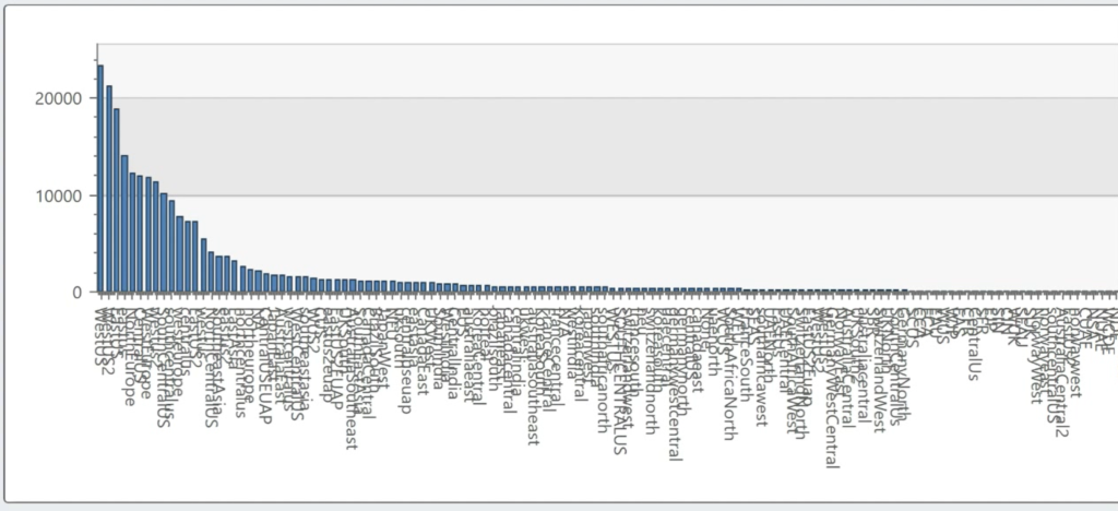
at this histogram: we’re looking at how different teams at Microsoft name
Azure’s data center regions. I get 168 values from this query, but I know that
Azure has 56 regions. Different service teams are naming the regions
differently.
Now look at
the shape of that data: while I have a long tail of values, the bulk of my data
looks like it falls within a small set. In fact, just 23 of 168 account for 80%
of the values. To me, that feels like a decent candidate for a dimension.
In contrast,
look at deployment actions—these values represent all the complexity of
delivering new features to Azure. And I’m not using the word complexity
lightly. There are over 9,000 different actions here. I can’t even generate a
histogram in Kusto: it’s got a max of 5,000 values.
Excel
doesn’t have that 5k limitation, but… even then, you can’t even see the
histogram there: the long tail of values is so long, it’s basically meaningless.
This is not a good candidate for a simple dimension.
Of course,
this is art, not science. Azure Regions feels like a good candidate for a
simple dimension, but deployment actions doesn’t.
Still, with
168 values for 56 regions, I also have to make a call about how to handle that.
Short-term, it’s easy to manually go through the list and normalize those
values down to 56 regions. For example, japaneast, jpe and eastjp are clearly
all the same thing. That solves my problem in the short-term, but what do I do
if a team decides to add a new value such as ejp or japane?
Again, we
come to art. I really only have two choices about how to handle this long term.
My first option is to create a job that monitors values in this dimension and
alerts me whenever a new value appears so I can normalize it. My second option is
to go to the team that owns this tool and insist that their users not have the
choice to enter in whatever value they want.
The second
option, in this particular case, is the right choice. As of March 2020, we have
56 data centers, and there’s no legitimate reason for one service team to have
a different set of characters to represent the japan east region than all the
other Azure service teams.
To put it
another way, there’s a moral hazard here. If I go about cleansing that data
once, the team owning that telemetry won’t have to. And I’ll keep having to
cleaning it again and again and again.
But that’s
not always the right answer. There’s not always a moral hazard.
Setting up an
alert to manually handle the new value may be the right choice. For example, I
was once responsible for providing data to Surface marketers. And every year,
two or three months before Black Friday, I saw a brand-new Surface model name pop
up in Windows telemetry. Now, I wasn’t supposed to know about that new
device until October, but I considered my job to make sure that the data
engineers, analysts, marketers and data scientists that used the data my team
produced didn’t know about those new Surface models via the data my team
produced.
We made the
investment to monitor for new Surface model names, and when we found them, not
only did we alert the people who were in the know, but we made sure those new
model names didn’t appear in our data until it was time to execute marketing
campaigns promoting them.