Author: Michael
-
English Cove HOA action against BLM signs
I thought about delivering a copy of the below text to all of my neighbors. Katie talked me out of it. But it’s cathartic to write down my thoughts.
MY PERSONAL THOUGHTS ON ENGLISH COVE’S RULE ABOUT SIGNS
In a recent email communication, the English Cove Board of Directors reminded owners that posting signs visible outside their units is against our covenants, conditions & restrictions (CC&Rs), except in four narrow circumstances. The Board has not attempted to enforce this rule since I moved to English Cove in 2017. That is, until two weeks after I and two other residents posted signs with progressive messages including the words “Black Lives Matter.”
While the Board appears so far to be following best practices for resuming enforcement of a rule, I find the timing problematic, and worry that the Board will selectively enforce the rule against signs, fining me while ignoring the many other signs that are posted contrary to the CC&Rs. As such, I want to share with my neighbors my understanding of the Board’s legal obligations (and those of every Owner) in this area.
Please Note: I work in data engineering and analytics at Microsoft. I am not an attorney.
CAN THE BOARD LEGALLY PREVENT ME FROM EXERCISING MY FIRST AMENDMENT RIGHTS?
Yes. While the Association and its CC&Rs are subject to the Constitution, you can voluntarily give up some of your rights. When each of us purchased or leased a unit in English Cove, we each gave up our First Amendment right to post signs on our property without approval from the Board of Directors.WHAT TYPES OF SIGNS ARE PERMITTED?
For-sale signs, open-house signs, political signs (during an undefined period prior to an election), and security camera surveillance signs (if it is adjacent to the camera).WHAT TYPES OF SIGNS ARE NOT PERMITTED?
Anything else. This includes signs that have been or are currently posted in English Cove, such as ones which state or suggest:
• Your house is protected by a security firm;
• You support a particular sports team;
• Dogs are not permitted near your home;
• Your child graduated from school;
• An area is under surveillance when the sign is not adjacent to the camera itself; and
• You “welcome” people to your house.CAN I POST A POLITICAL SIGN NOW?
Maybe? The Rules only say “before” a primary or election. The Board may arbitrarily or capriciously redefine “before” at any time they choose, though they must use the same definition for everyone.WHAT KIND OF POLITICAL MESSAGES CAN I POST?
Who knows? The Rules provide no restrictions except that the sign must be related to a primary or election. You can post anything you consider is related to an election—including “Black Lives Matter.” At least until the Board arbitrarily decides that your political message is not related to a primary or election.CAN THE BOARD ALLOW SOME MESSAGES BUT NOT OTHERS?
It depends. The Board can allow some classes of signs, such as election-related signs. They can’t, however, prohibit signs from one political party while allowing them for another. In other words, if the Board permits me to keep a Black Lives Matter sign in my window, they must also permit signs supporting White Nationalism.CAN THE BOARD SELECTIVELY ENFORCE THE RULE FOR SOME OWNERS BUT NOT OTHERS?
No, but… While selective enforcement is illegal, the Board can basically do whatever it wants unless a higher authority such as a county or state court intervenes. From my experience, selective enforcement is the norm in English Cove.CAN THE BOARD CHOOSE NOT TO ENFORCE A RULE?
Yes. While HOAs may not enforce a rule selectively, they are not required to enforce every rule in the CC&Rs.CAN THE BOARD CHANGE THE RULES TO PERMIT MORE TYPES OF SIGNS?
Yes. The Board does not need to follow any special procedures to do so: they do not even have to hold a meeting to receive feedback residents. -
A fire at my neighbor’s house
The power went out around 5pm in southeast Redmond yesterday, including in our neighborhood, the English Cove HOA.
OMG EMERGENCY! Said the children. Who couldn’t get on screens. Oh the humanity!!!!!
My wife, Katie, and I were already feeling lazy about dinner—it’d been two straight months on lockdown since returning from the Canby, Oregon funeral of my wife’s aunt on 14 March 2020. That was just a day or two before both Washington and Oregon banned events of more than 50 people.
Preparing three meals a day at home, week after week, was wearing thin. Especially because our two kids, Quinn (8) and Joe (5) were picky eaters and demanded different meals.
We had placed an order with Rocky’s Empanadas just a few minutes before the power went out. It’s a takeout place that we have passed at least once a day since we moved from Seattle to Redmond in 2015. We’d never been to Rocky’s before, but with so few restaurants open for takeout, and the menu items hit-or-miss, we were looking for something different. So we finally placed an order on Rocky’s website just to get some variety. And the option to buy some empanadas frozen to eat later? So much better than the make-shift, leftovers-wrapped-in-a-tortilla lunches I had become accustomed to over the past couple months.
The pickup was a little chaotic. Their lights were out, of course. And I couldn’t enter the place: they had placed a desk blocking their door. You could open the door, but you really couldn’t get in. I definitely couldn’t see in the back. Still, we were lucky—our empanadas had just come out of the oven when the electricity cut out.
Back home, with our poor, internet-deprived children playing out of doors for the first time in ages, we had a delightful dinner sitting in our driveway with a bottle of wine. The empanadas were amazing!
About ninety minutes later, around 6:30 pm, the power came back on. Within minutes, our kids had reapplied Krazy Glue to their eyeballs and pressed their screens tightly to them. The evening was proceeding per lockdown usual (fine, we had been in Phase 1 for two weeks, but it wasn’t much different from lockdown, except emotionally).
And then the smoke detectors started blaring. I jumped up on a chair to push the “stop it” button but it didn’t work. I ran through our entire townhouse looking for… well, anything amiss. It took a bit to realize it wasn’t our smoke detectors. It was the heat alarm system that was connected to the other three townhouses in our building.
Then a knock on the door: it was Kalyani from next door, telling my wife, Katie, there was a fire. Katie yelled to me upstairs “FIRE!” I ran downstairs, a bit confused, I had checked the entire house and there was no fire, but… you know. Get out, right?
Kalyani was in a bit of a panic, and all of four of our kids were completely freaking out. But… I figured it couldn’t be that big, based, of course, on no evidence whatsoever.
I broke open the fire extinguisher by our door, went into their house and saw a maybe five-foot high column of flame billowing up from the right front burner of their range. Lots of black smoke, but not a big fire. Pulled the trigger and… Of course, the extinguisher didn’t work: I forgot to pull the pin. I was already coughing from the smoke, and couldn’t see anything other than the fire. I went out, pulled the pin, went back in, squeezed the trigger for maybe two seconds, and the fire was out. Still tons of smoke and I could feel the burn in my lungs.
Outside, folks were wondering if we should call the fire department. I figured there was no point: the alarm was connected to Redmond FD, and a station was just across Fall City Road.
Then Kalyani asked if we should go in and turn off the range. Oh. The range was on? Right. Yes, I had just put out a fire on her range. Of course it was on. Duh. I grabbed an N95 construction mask from my garage and went back inside Venkat and Kalyani’s place (why didn’t I grab the mask earlier?). The range was molten red and the metal pot on it was melting. No point going through all that smoke to turn off the burner, though: I told Venkat we should just kill the power at the breaker box in their garage. When we got to the panel, the microwave breaker had already tripped. I killed the range, and then figured I’d just kill the power to all the kitchen appliances. Why not?
Then the Redmond Fire Department showed up. Couldn’t have been more than two or three minutes from when the alarm started. Must have been a non-event for them, I guess. The fire was out.
We all stood outside for 20+ minutes, watching the firemen open up Venkat and Kalyani’s place to let the smoke out, and make sure there was no fire smoldering in their kitchen.
Then one of the firemen pulled me aside and did a quick health check. He said I seemed fine, but recommended I go to the ER to make sure I didn’t have carbon monoxide poisoning. He was concerned about the huge lungfuls of smoke I’d inhaled during my three trips into my neighbors’ townhouse. Of course, Katie had already told me I should go to the ER—a suggestion to which I was predictably dismissive. I accept and embrace what I know Katie must have been thinking at that moment: “MEN!”
I grudgingly agreed as the fireman and my wife ganged up on me. I would visit the ER at Swedish less than a mile away. Katie wanted me to take the car—she wanted to drive me, frankly. The fire truck was blocking the driveway so we couldn’t get the minivan out, and… I’m a dude. So… I rode my Vespa.
Listen, I’m a guy. It’s genetics. I don’t ask for directions, I don’t go to the doctor, and if I need to go to the ER, I’m bloody well going to get there on my own even if I’ve got a limb falling off. Riding my Vespa so that I could get checked out for a condition that might make me dizzy and pass out? RAWR!
Besides, I hadn’t been on my Vespa in months.
All the doors at Swedish were locked shut. Just the one door to the ER. There couldn’t have been more than a dozen cars in the parking lot, either.
The guy at admitting said I could go to the ER or to Urgent Care. Well, he said that after he handed me a mask and asked me several COVID-19 related questions and handed me a face mask. One of the questions was “do you have a dry cough?” My answer “well, I just did inhale a ton of smoke.” We both laughed.
When he said “ER” all I could think of was the bill we got when Katie had an ER visit a while back. I can’t recall what it was for, but I do remember it was serious business. And I have fantastic health care through Microsoft, so the real cost must have been insane. I chose Urgent Care. Cheaper! I’m a dude!
There was no one there. I can’t ever recall going to a medical facility whose waiting room wasn’t at least half full. But I was the only person there that wasn’t an employee. Still, I had a 15-minute wait. It would’ve been wrong to be seen immediately.
The physician’s assistant checked my oxygen levels and listened to my lungs. She said I could go to the ER and get a blood test and an x-ray if I wanted, but… she didn’t think it was worth it, considering how little time I was exposed to the smoke, and how I wasn’t really showing any symptoms of carbon monoxide poisoning. Sounded good to me.
When I got home, Katie had both kids in bed with her. They were stressed out, and nothing was going to get them to sleep except their mom.
But… kids are kids, and Joe was poking Quinn, even in a king-sized bed. So Quinn came to Joe’s room, where I’d been sleeping recently. Katie had been sleeping with Joe because of how her stress-induced Shingles (i.e. Coronavirus-induced Shingles) were keeping her up at night. Her tossing and turning would surely keep me up too, but Joe sleeps like a log.
And while I didn’t feel an ounce of adrenaline or worry or fear when I went into Venkat and Kalyani’s place to put out the fire, when I finally got home from Swedish I was all wired up. I lay there next to my daughter for at least thirty minutes before she succumbed to sleep. Me? I didn’t fall asleep until hours later, well after midnight.
As I tried to unwind while the rest of the house was asleep, I couldn’t stop thinking about how our two families stood as we watched the firemen close things down.
For two months, Venkat, Kalyani, Katie and I had consciously prevented our daughters, Quinn, Manushri and Pravasti, from playing together. We had kept at maximum distance from each other in the rare times we were in our joint entryway, and kept even further away when we exchanged a few words.
It wasn’t just about following the rules: less than a week after the funeral in March, one of Katie’s aunts tested positive for COVID-19, and several other members of her family exhibited symptoms. We had all spent plenty of time together that weekend.
The fire was a strangely normalizing event despite its abnormality. All eight of us stood, shoulder-to-shoulder, along with a few of our neighbors. All thoughts of social distancing and COVID-19 were gone in the face of a fire.
-
Kusto: Creating an IfExists function to check if a table exists
One of the things I find lacking in Kusto is an explicit way to test for the existence of a table: in both Azure SQL and Azure Data Lake, the ifexists function and exists compiler directive, respectively served this purpose.
Kusto doesn’t seem to have an explicit statement supporting this, but you can roll your own using the isfuzzy union argument. The isfuzzy argument basically says that a union should run as long as at least one table exists.
So here’s how to create your own “ifexists” function for kusto.
Write a function that takes a table name as a string input. Within the function itself, create a datatable with a single row named Exists with a value of 0.
Then union that datatable with the function input using the table operator like so and do a count of rows alias with the name Exists. I’d limit this to a single row, so you minimize execution.
Finally, sum up the Exists column result of your union so that you have only a single row. If the tablename from the input exists and has at least one row, your function will return 1. If it doesn’t exist or is empty, your function will return 0.
When using this, you convert the table output of the function to a scalar value using the toscalar function, like so. That’s it.
Of course, you don’t have to use this as a distinct function: you could simply have a fuzzy union in your code.
There is another way to do this if you’re writing an ETL function that acts differently depending on whether the table exists. We do this with very large telemetry sets when we just want to pull new values rather than pulling months’ worth of data and overwriting.
When we’re actively developing such a function, we may need to change the schema or do a compete reload. So if the table doesn’t exist, we want to pull a much larger set of data rather than just the past day or so.
Here’s the trick: once a function is compiled, it will run regardless of whether the tables upon which it relies exist. When you aggregate a non-existent table to a single row and convert the output to a scalar—say, the most recent datetime—Kusto returns a null value without any error. We check if that value isempty, and if it is, we grab several months’ worth of data, rather than just the new rows.
-
Kusto: Creating Dimensions with the datatable operator
I’m Mike O’Neill and I’m a data nerd who uses Azure Data Explorer, or Kusto, every day to glean insights into Azure’s developer and code-to-customers operations.
In my last video, I talked about how to assess a new data source to identify potential simple dimensions.
Kusto presents a singular problem for creating simple dimensions, especially when you’re used to storing dimensions as a table. You can’t create a little table as you would in Azure SQL and just insert and update values as you please. You also can’t repeatedly overwrite a stream as I used to do in Azure Data Lake.
In fact, you can’t really update anything in Kusto, nor can you overwrite a table that easily either. But Kusto does have an interesting workaround: you can write a list of comma-delimited values, use the datatable operator to make it into a table, and embed that into a function. Need to make changes? Just edit the text.
Let me give you a real example I wrote last week. One of the things I need to track for Azure’s engineering pipeline work is the name of the datacenter to which we’re deploy. Now, there’s nothing secret about this dimension: I pulled the info from these two public webpages.
Instead of creating a table like I would in Azure SQL, I just format all the values as a CSV, and then wrap it with the datatable operator. That operator requires three things: the operator itself, the schema immediately after it, and then a pair of square brackets around the CSV values.
Create that as a function, et voila, you’ve got a dimension. Anytime I need to update the values, I just update the function.
It’s not a perfect solution, however: because you’re just working with text, you’ve got none of the referential integrity capabilities of Azure SQL. Nor can you easily rebuild the dimension programmatically so that you don’t make silly mistakes.
I made that mistake last week, though it was with a mapping function with about 300 values rather than a pure, simple dimension. My colleague left a comment on my pull request, asking me to “find Waldo.” It was a friendly tease because I hadn’t bothered to do a simple check for duplicates.
If you use this method, you’ll need to be extra careful to maintain and run regular unit tests every time you alter the function.
And since early March, all of us in the State of Washington have been living through social distancing for the novel corona virus, my colleague teased me a little bit more, with this new version of “where’s Waldo.”
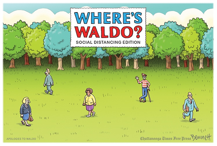
Stay healthy.
-
Kusto & Data quality: identifying potential dimensions
I’m Mike O’Neill and I’m a data nerd who uses Azure Data Explorer, or Kusto, every day to glean insights into Azure’s developer and code-to-customers operations.
A data engineering lead I work with recently asked me what his team should do to deliver high quality data. I’ve lucky enough to spend most of my career in organizations with a data-driven culture, so it’s the first time I’ve been in a position to teach rather than learn.
And so I didn’t have an easy answer. Data quality isn’t something I’ve classified in any way, it’s just something I’ve learned how to do through trial and many, many, many errors. I discussed it with my boss and she tossed down the metaphorical gauntlet: “Michael, list out the different data quality tests you think are necessary.”
My first reaction was that the most important thing for exceptional data quality is to have as many people look at the data as possible. It’s a bit of a dodge, I’ll admit. Linus’ Law really does apply here: “given enough eyeballs, all bugs are shallow.” But there are never enough eyeballs.
So here goes. There are a lot of things to look for, and I’ll create a video for each one. If you’ve been in the data engineering space for a while, you should probably skip this series.
Identifying potential dimensions is one of my top tasks, and for this video, I’m just looking at simple dimensions with a handful of values, maybe a few hundred at the extreme. I’m not looking at complex dimensions such as product catalogs which could have tens of thousands of values.
All I do is examine every column that might be a dimension of some sort. Generally, I ignore datetimes and real numbers, but short strings and bytes are good candidates. Then I aggregate, getting a count of rows for each potential value.
At this point, it becomes art rather than science, but a histogram can help push the scales a bit more into science.
Take a look at this histogram: we’re looking at how different teams at Microsoft name Azure’s data center regions. I get 168 values from this query, but I know that Azure has 56 regions. Different service teams are naming the regions differently.
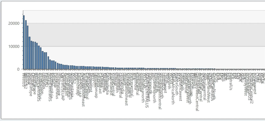
Now look at the shape of that data: while I have a long tail of values, the bulk of my data looks like it falls within a small set. In fact, just 23 of 168 account for 80% of the values. To me, that feels like a decent candidate for a dimension.
In contrast, look at deployment actions—these values represent all the complexity of delivering new features to Azure. And I’m not using the word complexity lightly. There are over 9,000 different actions here. I can’t even generate a histogram in Kusto: it’s got a max of 5,000 values.
Excel doesn’t have that 5k limitation, but… even then, you can’t even see the histogram there: the long tail of values is so long, it’s basically meaningless. This is not a good candidate for a simple dimension.
Of course, this is art, not science. Azure Regions feels like a good candidate for a simple dimension, but deployment actions doesn’t.
Still, with 168 values for 56 regions, I also have to make a call about how to handle that. Short-term, it’s easy to manually go through the list and normalize those values down to 56 regions. For example, japaneast, jpe and eastjp are clearly all the same thing. That solves my problem in the short-term, but what do I do if a team decides to add a new value such as ejp or japane?
Again, we come to art. I really only have two choices about how to handle this long term. My first option is to create a job that monitors values in this dimension and alerts me whenever a new value appears so I can normalize it. My second option is to go to the team that owns this tool and insist that their users not have the choice to enter in whatever value they want.
The second option, in this particular case, is the right choice. As of March 2020, we have 56 data centers, and there’s no legitimate reason for one service team to have a different set of characters to represent the japan east region than all the other Azure service teams.
To put it another way, there’s a moral hazard here. If I go about cleansing that data once, the team owning that telemetry won’t have to. And I’ll keep having to cleaning it again and again and again.
But that’s not always the right answer. There’s not always a moral hazard.
Setting up an alert to manually handle the new value may be the right choice. For example, I was once responsible for providing data to Surface marketers. And every year, two or three months before Black Friday, I saw a brand-new Surface model name pop up in Windows telemetry. Now, I wasn’t supposed to know about that new device until October, but I considered my job to make sure that the data engineers, analysts, marketers and data scientists that used the data my team produced didn’t know about those new Surface models via the data my team produced.
We made the investment to monitor for new Surface model names, and when we found them, not only did we alert the people who were in the know, but we made sure those new model names didn’t appear in our data until it was time to execute marketing campaigns promoting them.
-
Kickstarting a data-driven culture: Same meeting, many conversations
I’m Mike O’Neill and I’m a data nerd who uses Azure Data Explorer, or Kusto, every day to glean insights into Azure’s developer and code-to-customers operations.
I’ve worked in data-driven organizations for most of the last decade plus, so it’s been a bit of a culture shock to work in an organization that doesn’t have data and analytics in its DNA.
I knew coming in that my team in Azure didn’t have the foundation of a data-driven culture: a single source of truth for their business. That was my job, but I naively expected this to be purely a technical challenge, of bringing together dozens of different data sources form a new data lake.
I learned very quickly that people are the bigger challenge. About a year into the role, my engineering and program management Directors both hired two principal resources to lead the data team. I was excited, but the three of us were constantly talking past each other, and now I think I know why.
I was working to build a single source of truth so that many people, including our team, could deliver data insights, but those new resources focused on us delivering data insights.
The difference is subtle, I realize, but it’s a big deal: if we only deliver data insights, we’ll end up as consultants, delivering reports to various teams on what they need. That’s work for hire, and it doesn’t scale.
If we build a single source of truth, those various teams will be able to self-serve and build the reports that matter to them. Democratizing data like that is a key attribute of a data-driven culture.
So why were the three of us talking past each other when we were talking about same business problems? I think it was a matter of perspective and experience.
To oversimplify the data space, I think there are four main people functions, and the experience learned from each function guides how people view the space. Our v-team had people from all of those spaces, and the assumptions we brought to the conversation were why we were speaking past each other.
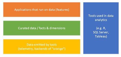
First is this orange box, which is about doing, well, useful stuff with data. This is what everybody wants. This is where data scientists and analysts make their money.
The risk with this box is an overfocus on single-purpose business value. It’s great to have a useful report, but people who live only in this box don’t focus re-usable assets. Worst case scenario, it’s work-for-hire, where you shop your services from team to team to justify your existence.
Second is this yellow box, which represents telemetry. I’m using that word far more broadly than the dictionary defines it: to me, it’s the data exhaust of any computer system. But that exhaust is specific to its function and consumption is typically designed only for the engineers that built it.
The risk here is around resistance to data democratization. If you’re accustomed to no one accessing the data from your system, you won’t invest the time to make it understandable by others. When you do share the data, those new users can drown you in questions. Do that a few times, and you learn to tightly control sharing, perhaps building narrowly scoped, single-purpose API calls for each scenario.
Third, you need tools to make sense of the data: this is the blue box in my diagram. There’s a bajillion dollars in this space, ranging from visualization tools such as PowerBI and Tableau, to data platforms such as Azure Data Lake, AWS Redshift and Oracle Database. The people in this space market products to the people in my orange box, whether it’s data scientists or UI designers.
The risk in the blue box is in the difference between providing a feature relevant to data and delivering data as a feature. It’s easy to approach gap analysis by talking to teams about what data their services emit and taking at face value their assessment of what their data describes.
If you are in the data warehouse space, however, a gap analysis is about the data itself, not in the tools used to analyze that data. Data gaps tend to be much more ephemeral than gaps in data product features, especially when you are evaluating a brand-new data source. In my experience, a conversation is just a starting point. You can trust, but you need to verify by digging deeply into the data.
And that brings me to the green box. In current terminology, that’s a data lake, and it’s where I’ve lived for the past decade. The green box is all about using tools from the blue box to normalize and democratize data from a plethora of telemetry sources from the yellow box, such that people in the orange box can do their jobs more easily. It’s about having a single source of truth that just about anyone can access, and that’s one of the foundations of a data-driven culture.
So what’s the risk in the green box? I like to say that data engineers spend 90% of their time on 1% of the data. Picking that 1% is not easy, and perfecting data can be a huge waste of money. Data engineering teams are very, very good at cleaning up data, and they are also very, very good at ignoring the law of diminishing returns. But they are not very good at identifying moral hazards, at forcing upstream telemetry sources to clean up their act.
-

Kusto: outliers and Tukey fences
One of the challenges I face is handling outliers in the data emitted by the engineering pipeline tools that thousands of Azure developers use. For example, our tools all have queues, and a top priority is that queue times are brief.
This is the shape of data you’d expect to see for a queue. A quick peak after a few seconds, and then this long tail.
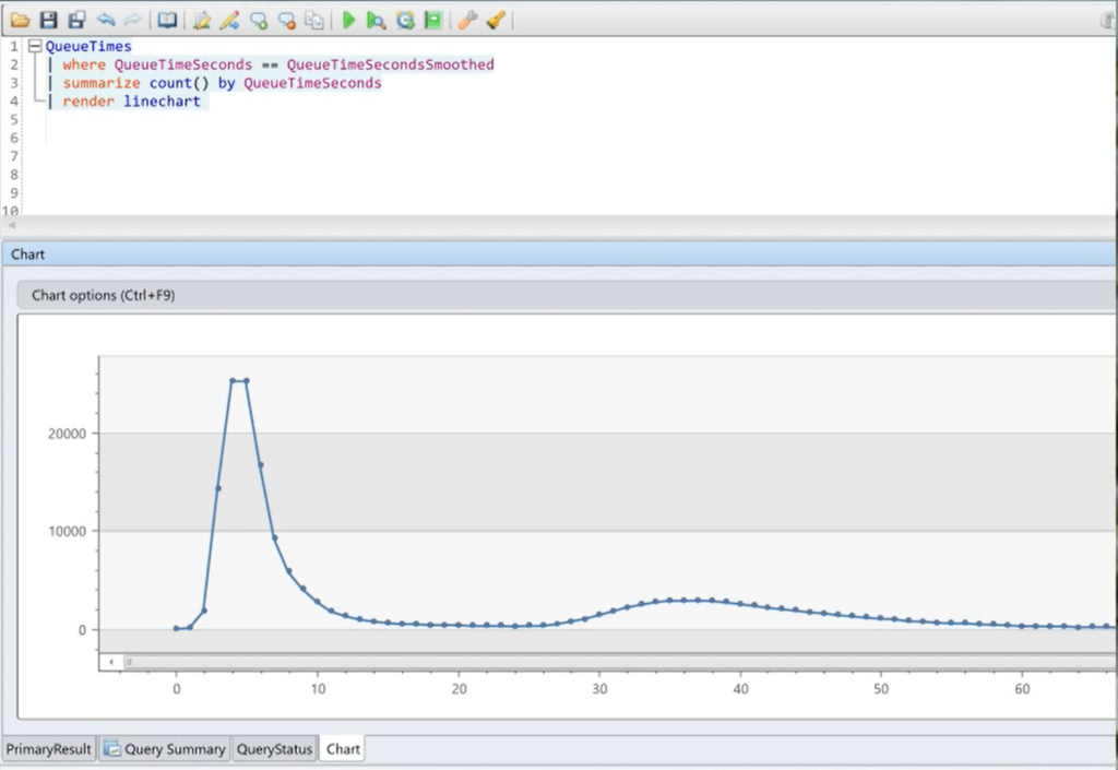
What queue times should look like But that’s not what our actual distribution of queue times looks like. The long tail is so long, it looks like a right angle.
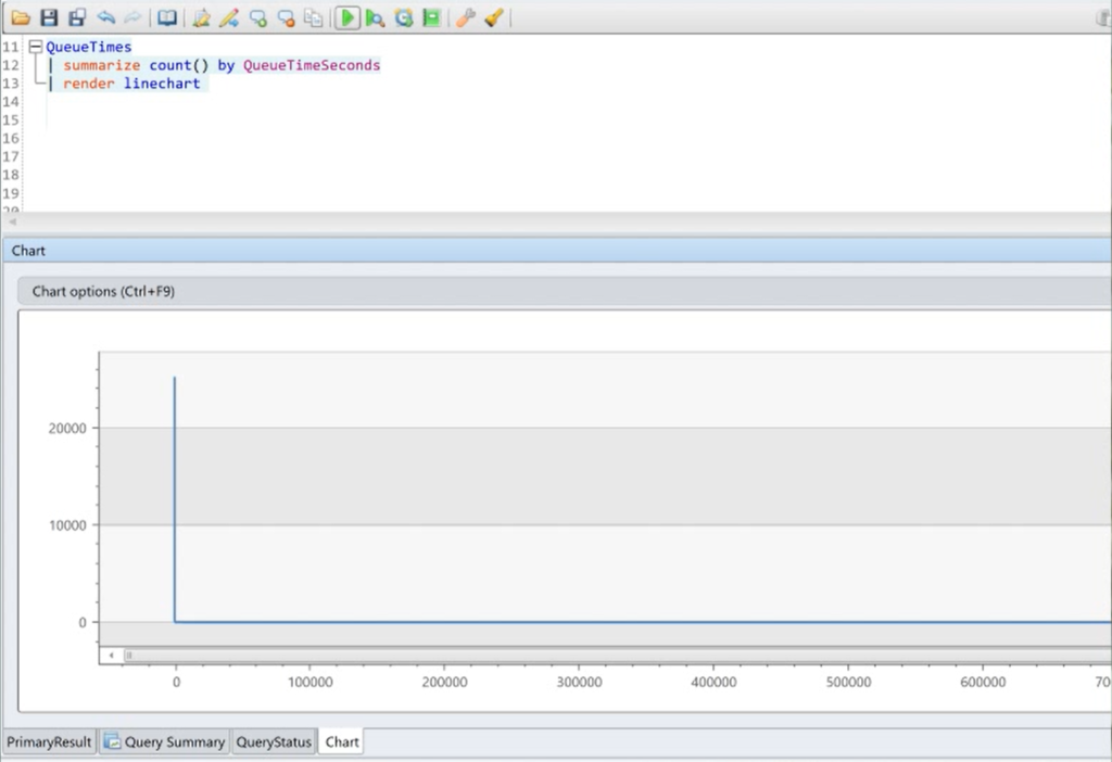
What they actually look like So what’s happening? Well, the mean queue time is 197 seconds, but if I remove the outliers, it’s just 18 seconds. Why the huge difference in averages? My max queue time is almost ten days, but when I exclude outliers, the max is just 81 seconds.
Six percent of my queue time values are outliers, ranging from minutes to days. I asked the team that manages this tool, and several things could be happening, from teams pausing a job while it’s in the queue, to misconfigurations by users. In short, none of these values represent valid queue times.
So how do I exclude those extreme values? I could pick an arbitrary line: everyone here in Azure loves the 95th percentile, because everyone remembers that’s two standard deviations from the mean in a Normal distribution. The problem is that the 95th percentile isn’t relevant for this type of distribution: it’s just luck that in this case, the 95th percentile is 106 seconds. It could just as easily be thirty minutes.
The better way to do this is to identify outliers based on the data. In fact, that’s the definition of an outlier: a data point that differs significantly from other observations. One common method of doing is called Tukey’s fences. I don’t have a Ph.D. in statistics, so I’m not going to explain how it works. In fact, that’s not what this channel. It’s about showing how to do powerful things in Kusto without a lot of effort, and Kusto’s series_outliers operator is just that.
Here’s how you do it.
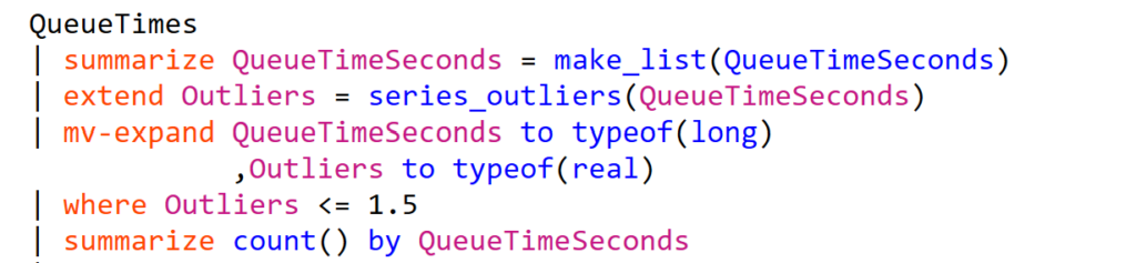
Step 1: pack all the QueueTime values into a list using the make_list operator.
Step 2: feed that list into the series_outliers operator.
Step 3: unpack it all with mv-expand.
Step 4: is the one bit that Kusto doesn’t do automatically for you. The values in the Outliers column aren’t self-explanatory, but they represent how far the measurement is from the bulk of your data. Anything greater than 1.5 or less than -1.5 is an outlier, and beyond plus-minus three, the values are really, really out there.
You can’t have negative queue time, so I just look at values below 1.5 and I’m set.